Available wizards
PPM provides you with many wizards that help you create your analyses or analysis views. The selection of wizards available depends on the analysis realm or module you select. In addition to the default wizards, different analysis realms and modules provide additional, specific wizards.
The selection of analysis wizards provided in PPM depends on the relations that are customized for your current PPM client. This means, that only with the following relations available in PPM the appropriate analysis wizards are provided.
ORG-ORG-Relation the Communication Network and the Relation Explorer is available.
FUCTION-ORG Relation or an ORG-FUNCTION-Relation the Relation Explorer and the Activity analysis is available.
FUNCTION-FUNCTION-Relation, the Function flow and the Activity analysis is available.
The following wizard are available in PPM.
Launches the 2D Chart Wizard that enables you to display your analysis in the form of a 2D chart. Various 2D chart types are available.
Launches the 3D Chart Wizard that enables you to display your analysis in the form of a 3D chart. Various 3D chart types are available.
Launches the Candle Chart Wizard that enables you to display your analysis in the form of a candle chart.
Candlestick charts allow you to display the average values of a single measure in terms of a single dimension. In addition to the average value, the minimum and maximum values of the measure are displayed.
Launches the Measure Overview Wizard that enables you to display your analysis in the form of a measure overview.
Measure overviews provide an overview of multiple measures in terms of their comparison values or a dimension.
Launches the Combined Chart Wizard that enables you to display your analysis in the form of a combined chart.
Combined charts provide you with an overview of your analysis of one or multiple measures in terms of one or multiple dimensions. A combined chart consists of different chart types, for example, columns, lines and areas.
Launches the Lorenz Chart Wizard that enables you to display your analysis in the form of a Lorenz chart.
Lorenz charts allow you to query an analysis of a single measure in terms of a single dimension.
Launches the Bubble Chart Wizard that enables you to display your analysis in the form of a bubble chart.
Bubble charts provide an overview of two or three measures in terms of a dimension.
Launches the Radar Chart Wizard that enables you to display your analysis in the form of a radar chart.
Radar charts provide an overview of multiple measures in terms of their comparison values or a dimension.
Launches the Table Wizard that enables you to display your analysis in the form of a table. Various table types are available.
Launches the Speedometer Chart Wizard that enables you to display your analysis in the form of a speedometer chart.
Speedometer charts provide an overview of a measure in terms of its comparison values.
Launches the Process Mining Wizard.
You can use Process Mining to identify suspected deviations and weak spots in your processes. Process Mining automatically identifies conspicuous fluctuations in measure values for particular dimensions.
Launches the EPC Wizard that enables you to display your analysis in the form of an EPC.
Launches the Assessment Chart Wizard that enables you to display your analysis in the form of an assessment chart.
Assessment charts provide an overview of a measure in terms of any number of dimensions.
Launches the Time Series Analysis Wizard that enables you to display your process analysis in the form of a time series.
Time series analyses provide you with an overview of the progression over time for one or two measures. Time series analyses are represented in the form of a trend chart, that is, a two-dimensional line chart with a separate line being displayed for each analyzed measure and the Time dimension plotted on the X-axis.
Launches the ABC Movement Analysis Wizard
You can use ABC movement analyses to represent the different assignments of individual dimension values in a dynamic ABC classification to the three segments of an ABC classification over time.
Launches the Top-Flop Analysis Wizard
Top-flop analyses enable you to get a quick overview of the best (top) and worst (flop) values of a measure for one or more dimensions.
Launches the Ranking Analysis Wizard
Ranking analyses support you in the quantitative comparison of your processes as part of benchmarking.
Launches the Action Wizard that enables you to create an action for your analysis.
The components of continuous business improvement include Activities and Comments as possible measures. After identifying weak spots, you can define tasks, so-called activities, to improve the processes. Each user can write comments on an analysis that can be read by other users.
In a distribution chart, you can display the frequency distribution of a distributable measure's values for a number of process or function instances.
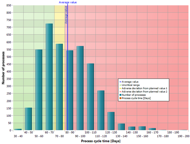
On the y-axis, the number of processes or functions run for the values of a distributable measure (x-axis) is displayed.
If you want to display planned values, the chart is divided into the colors green, yellow and red. Additionally, you can use statistical analysis options for this chart type, such as average value of distribution with the corresponding standard deviation, median, and percentile.
You can use a flow chart (Gantt chart) to display the progression of an EPC over time. A flow chart displays all the functions of an EPC with a start and end time.
With a scatter chart, you can represent the context of two distributable measures for a number of process or function instances.
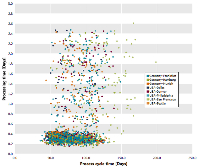
The scatter chart (correlation chart) displays a data point for each individual or aggregated process instance or function instance. Each data point is a value pair of two distributable measures that are entered on the two axes of the chart.
If the measures are distributed over different dimension values (for example, branch Hamburg, Berlin and Munich) the dimensions are displayed in different colors.
Tip
The individual data points have tooltips displaying the measure values and the value of the possibly existing dimension. If the data point is an aggregated instance or if multiple instances are on the same data point, the sum of the relevances is also displayed.
Launches the Relation Explorer Wizard that enables you to analyze relations between a specific organizational unit and other organizational units.
The wizard is available only if you select the Interaction analysis module.
Launches the Communication Analysis Wizard that enables you to analyze the communication structure and co-operation between organizational units.
The wizard is available only if you select the Interaction analysis module.
Launches the Activity Analysis Wizard that supports you in analyzing organizational unit activities and assessing them in terms of time, costs, and quality.
The wizard is available only if you select the Interaction analysis module.
Launches the Function Flow diagram wizard that supports you in analyzing the sequence of activities within your business processes. The Function Flow diagram displays and evaluates the process structure and the relationship between the activities.
Launches the Process Instance Search Wizard that enables you to search for process instances that match specific criteria.
The wizard is available only if you activate the Instance controlling module.
Launches the Alarm Value Analysis Wizard that enables you to identify process instances whose alarm value is exceeded or falls short.
The wizard is available only if you activate the Instance controlling module.
Launches the Early Alert System Wizard that enables you to identify process instances whose defined critical times have been exceeded.
The wizard is available only if you activate the Instance controlling module.
With the outlier analysis , you can identify process instances with a certain measure value above or below the average value or a defined limit value.
The wizard is available only if you activate the Instance controlling module.