How thresholds work
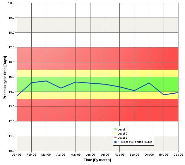
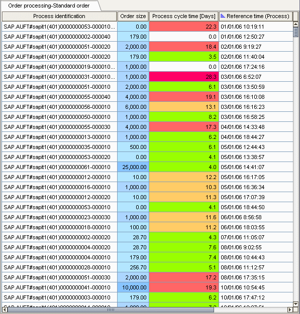
Thresholds are user-defined comparison values of measures that you can set in addition to planned values, depending on the type of analysis view. Depending on the type of your chart, the thresholds are displayed as a horizontal line or a shaded area in the chart background. In your table, the cells of the corresponding measures are accordingly colored, as well.
You can define individual thresholds for each measure in an analysis. For each measure, you can set up to five different threshold conditions that you can assign individual colors to. Thresholds that can be set are a definable value or a return value of a favorite that dynamically changes over runtime.
You can display thresholds and planned values in an analysis. By specifying a corresponding priority, thresholds or planned values are displayed if their values overlap.
Thresholds can be displayed in all chart and table types. If multiple measures were evaluated in an analysis, you can specify one measure whose thresholds are displayed with a higher priority.
The following example shows three defined thresholds for a "tunnel measure" in a line chart and the corresponding process instance table. Due to the different coloring, it is easy to identify suspected deviations for the measures.