Available chart types
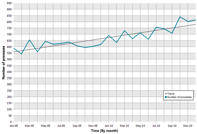
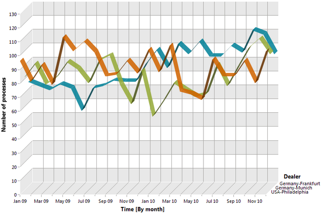
You can display your analysis results in two-dimensional or three-dimensional charts.
ARIS Process Performance Manager provides the following chart types for your analyses:
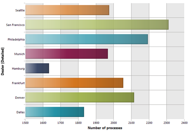
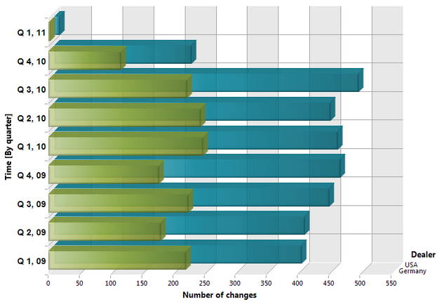
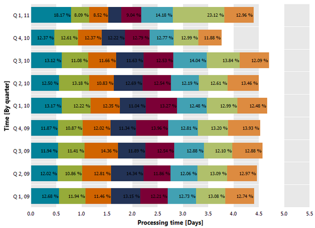
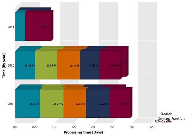
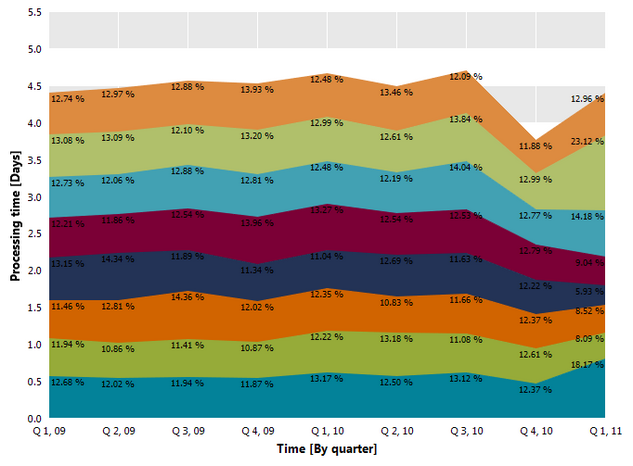
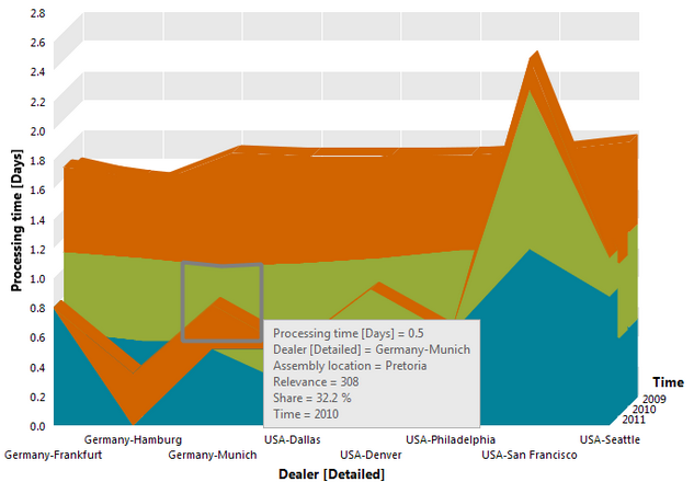
The percent area chart is a stacked area chart with the measure values being standardized to 100%.
You can select this chart type when analyzing one dimension and two measures or two dimensions and one measure. A percent chart can only be two-dimensional.
The measures must be of the same data type.
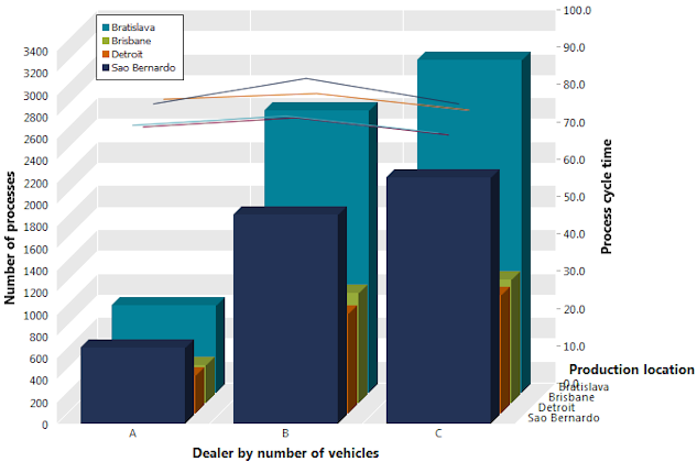
Combined charts provide you with an overview of your analysis of one or multiple measures in terms of one or multiple dimensions. A combined chart consists of different chart types, for example, columns, lines and areas.
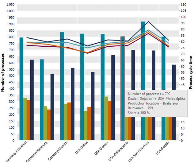
You can combine the following views:
One measure (column) over one dimension on the x-axis
One measure (column) over two dimensions on the x-axis, group or stack
One measure (column) over three dimensions on the x-axis, group and stack
Multiple measures of the same data type over one dimension on the x-axis. You can select if the measures are to be displayed next to each other in groups or on top of each other in stacks. If you select stacks, you can also selcect the view type (column, line or area) for each measure. Measures displayed next to each other are always displayed as columns.
Multiple measures of the same data type over two dimensions on the x-axis, group or stack. In this case, measures are always displayed as a column.
Two measures of different data types over two dimensions on the x-axis, group or stack. The first measure (left value axis) is displayed as a column and the second measure (right value axis) is displayed as a line.
You cannot display more than two measures with different data types in one combined chart. PPM automatically displays a combination of more than two measures with different data types in a suitable type of chart.
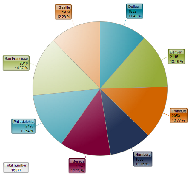
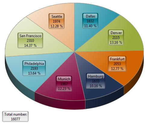
This chart type can be selected when you are using a measure and a dimension.
To use two dimensions or one dimension and a comparison value, you can display several small pie charts. A separate pie chart is displayed for each value of the second dimension or for the comparison value. To swap this assignment, right-click in the chart background and select Edit axis assignment.
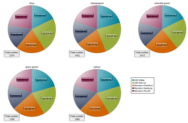
To make the view with several small charts clearer, hide the segment labels and show the legend. To do this, right-click in the chart background, select Display options  and check or clear the corresponding check box.
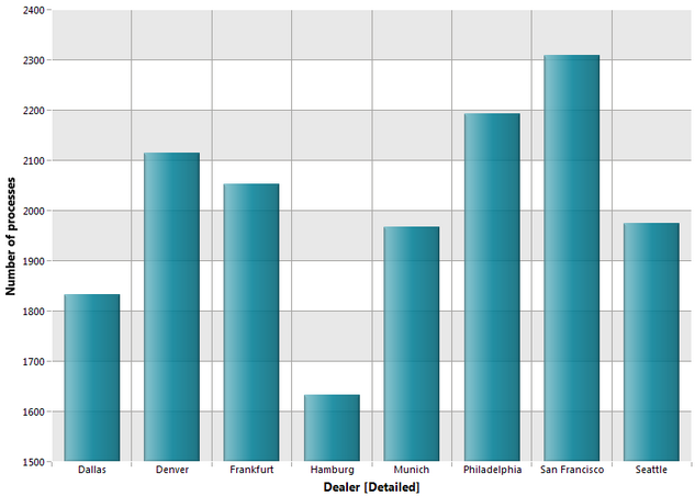
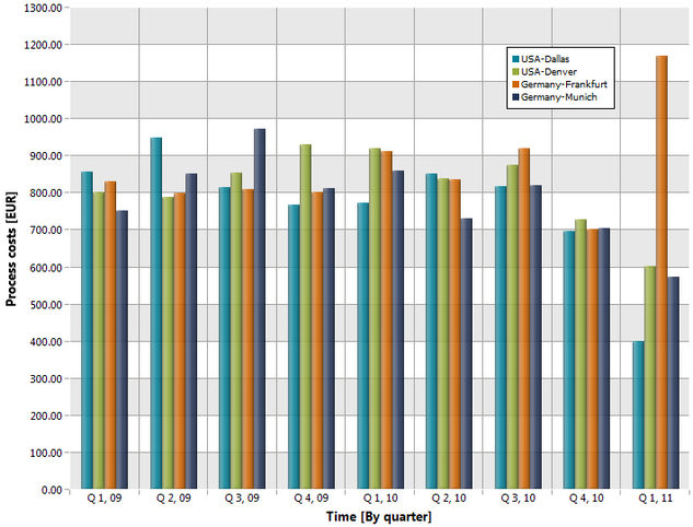
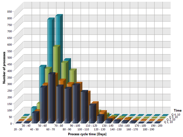
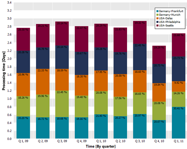
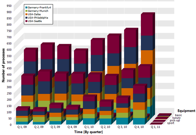
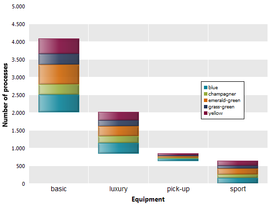
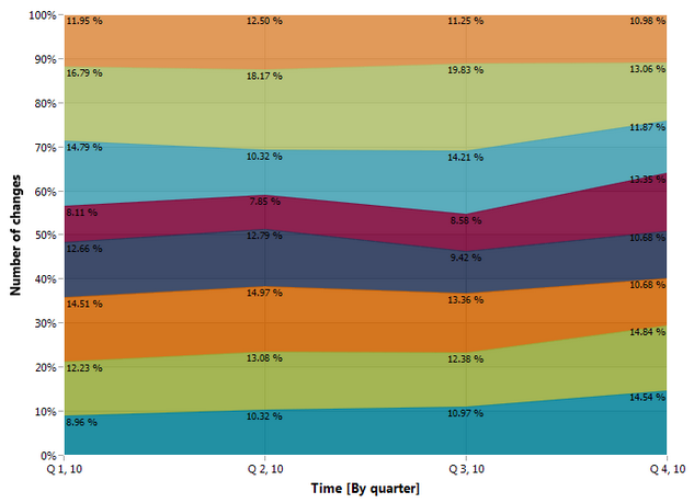
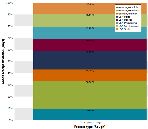
A percent chart is a stacked column chart with the measure values being standardized to 100%. In a two-dimensional stacked column chart, you can analyze one dimension and two measures or two dimensions and one measure. A percent chart can only be two-dimensional.
The measures must be of the same data type.
Assessment charts provide an overview of a measure in terms of any number of dimensions.
Each bar represents a dimension or measure that you are using as a dimension. Each bar segment represents a dimension step. The individual steps are delimited by a frame and the color shades. The lengths of the bar segments reflect the number of process instances included in measure calculation. The bar segments are sorted by measure quality from left (good) to right (poor).
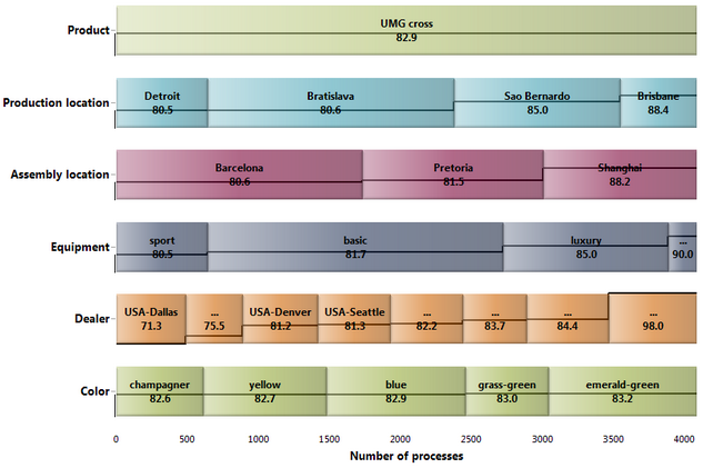
If you move the mouse pointer over a bar segment, the following information appears:
Dimension value
Measure value for this dimension value
Number of processes for this dimension value
If you display planned values, the bar segments are colored as follows:
Measure values…
better than planned value 1 green
between planned value 1 and planned value 2 yellow
worse than planned value 2 red
Bubble charts provide an overview of two or three measures in terms of a dimension.
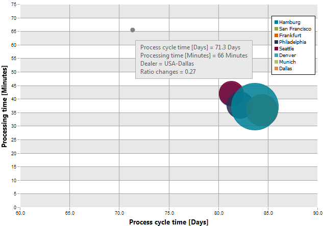
The first measure is mapped to the x-axis and the second is mapped to the y-axis. A circle is shown for each dimension value. The measure values for a dimension value are derived from the position of the circle: It lies on the intersecting coordinates of the two measures. If you use a third measure, its value is represented by the radius of the circle.
If you move the cursor over one of the circles, you will see information about the dimension value and the three measures.
Candlestick charts allow you to display the average values of a single measure in terms of a single dimension. In addition to the average value, the minimum and maximum values of the measure are displayed.In addition to the average value, the minimum and maximum values of the measure are displayed.
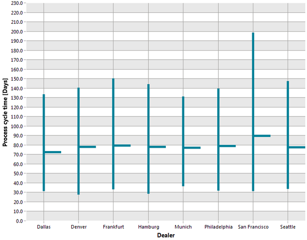
The individual bars indicate the minimum measure value at the lower end and the maximum measure value at the upper end. The boundary between the colors indicates the average value of the measure.
You cannot show any additional comparison values in this chart type.
A communication network enables you to represent the communication structure between organizational units.
As part of the communication analysis, PPM analyzes the relationships between the individual organizational units and aggregates the relationships like any other measure. For a communication network, you can set a relationship with just one measure for the relationship.
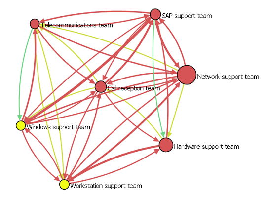
The connections represent the communication between the organizational units, with the thickness of the connection indicating the frequency of communication, for example. However, a communication network cannot show only the frequency of communication, but also any measure available for the relationship under analysis.
In a distribution chart, you can display the frequency distribution of a distributable measure's values for a number of process or function instances.
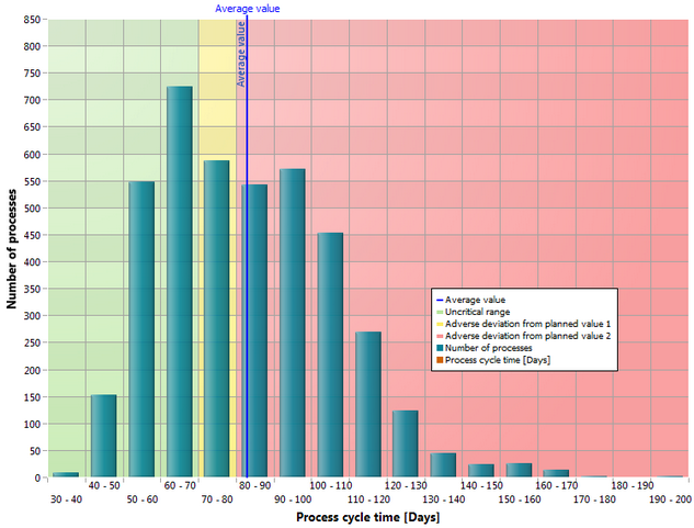
On the y-axis, the number of processes or functions run for the values of a distributable measure (x-axis) is displayed.
If you want to display planned values, the chart is divided into the colors green, yellow and red. Additionally, you can use statistical analysis options for this chart type, such as average value of distribution with the corresponding standard deviation, median, and percentile.
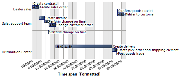
You can use a flow chart (Gantt chart) to display the progression of an EPC over time. A flow chart displays all the functions of an EPC with a start and end time.
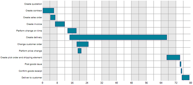
The x-axis shows the duration of a function relative to the start of the process that always starts at zero.
If the start and end times of a function are not specified in the EPC, PPM sets the end time of the preceding function as the start time, or the start time of the following function as the end time.
If no comparison values are queried, a single dimension can be added. The individual dimension values are displayed as comparison values in the form of horizontal bars.
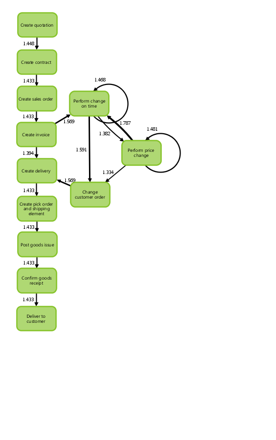
Lorenz charts allow you to query an analysis of a single measure in terms of a single dimension.Instead of the measure, you can display a comparison value.
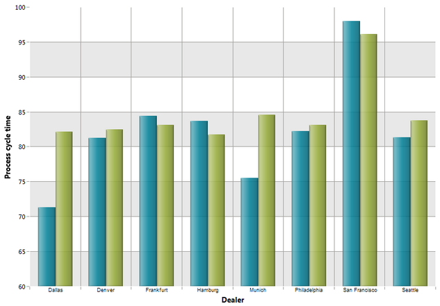
The aggregated values are displayed in addition to the measure values.
The values on the x-axis are sorted based on the rating of the measure values.
To change the sort direction, select the corresponding option in the Display options () on the X-Axis tab.
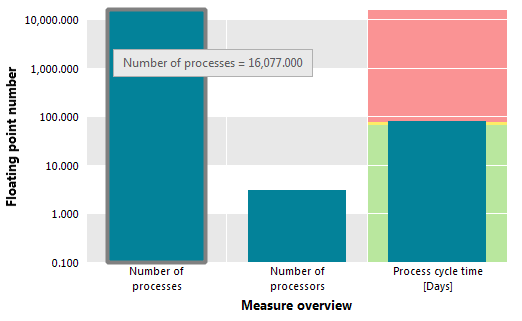
Measure overviews provide an overview of multiple measures in terms of their comparison values or a dimension.
The measure value and comparison values are displayed alongside each other as columns. This allows you to see the situation of each of the measures in terms of your comparison values.
If you are using a dimension in a measure overview, the measure values for each individual dimension value are shown next to one another as columns. This allows you to see the situation of each of the measures in terms of the individual dimension values.
In a radar chart, you can display at least three measures and their comparison values. Alternatively, in radar charts you can use at least three measures and a single dimension.
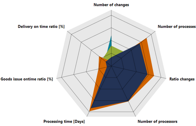
The chart contains an axis for each measure. The axes emerge in a star configuration from a single source and are of the same length. The view is two-dimensional.
One or more comparison values can be displayed for each measure. If one comparison value is displayed for several measures, the axes are connected by a line.
For a measure in a radar chart, you can display a corresponding speedometer chart or, if you are also displaying a dimension, a column chart. Move the mouse over the name of the measure until a tooltip appears. Then click the measure. A corresponding chart is displayed automatically.
You can change the orientation of the radar chart, that is, the better measure values appear toward the outside at the end of the axes or toward the center at the axes' origin. To do this, click the Display Options button and enable the desired option button.
Relation Explorer provides an overview of all relationships in a selected organizational unit. You can use Relation Explorer to display all relationships between a central organizational unit and other organizational units, functions (activities) and processes.For each relationship, you can set a single measure.
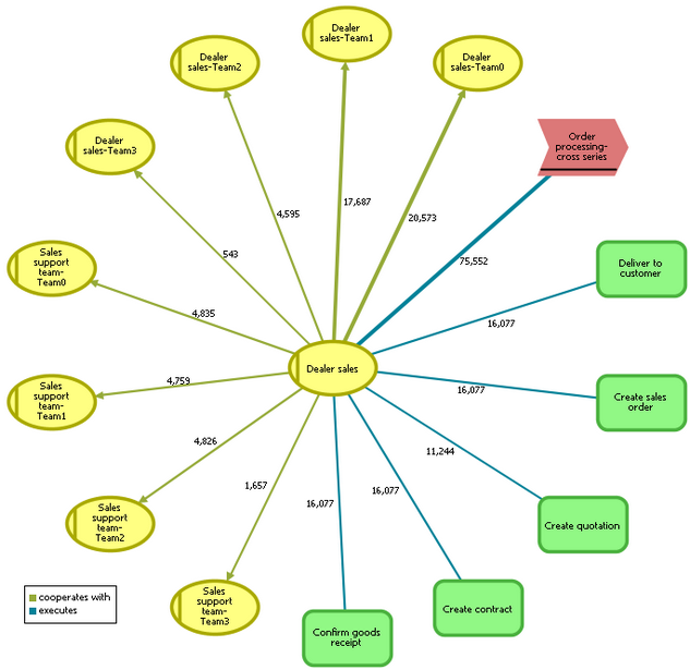
The direction arrow at the end of the relationship connections indicates whether the organizational unit is the source or target object of the relationship. The Relation Explorer displays only a single relationship type between the central organizational unit and a different object. If the central organizational unit has several relationships to the same object, this is displayed several times according to the number of relationships. The weight of the connections indicates the level of the measure value.
In a resource chart, you can display for individual process instances the time that certain organizational units require. A resource chart shows from when to when the involved organizational units performed one or multiple functions since process start. For an aggregated process instance, the average values are displayed.
With a scatter chart, you can represent the context of two distributable measures for a number of process or function instances.
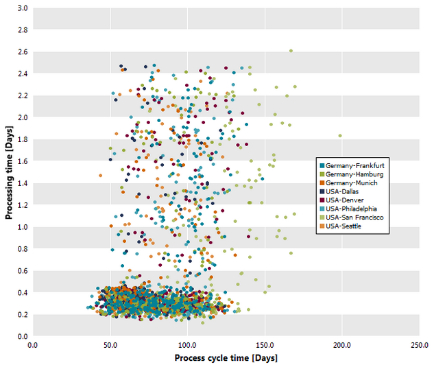
The scatter chart (correlation chart) displays a data point for each individual or aggregated process instance or function instance. Each data point is a value pair of two distributable measures that are entered on the two axes of the chart.
If the measures are distributed over different dimension values (for example, branch Hamburg, Berlin and Munich) the dimensions are displayed in different colors.
Tip
The individual data points have tooltips displaying the measure values and the value of the possibly existing dimension. If the data point is an aggregated instance or if multiple instances are on the same data point, the sum of the relevances is also displayed.
Select this chart type if you are using a measure and no dimension.
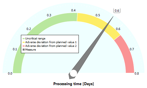
In a speedometer chart, the actual value of a measure is compared against the available comparison values of the measure. If you want to display planned values, the chart is divided into the colors green, yellow and red. If you display other comparison values, a different colored pointer is inserted for each comparison value.
The black pointer in the speedometer chart indicates the actual value of the measure.
You can set the value range, the orientation and the angles of speedometer charts using the Display options .
Tip
This chart type is also displayed if you click the name of a measure in a radar chart in which you have not displayed any dimensions.
In a waterfall chart, you can display as a column a single measure over one or two dimensions, or multiple measures of the same data type over a single dimension.
If you add a second dimension or an additional measure with the same data type, the additional values are displayed as a stack. When analyzing a second measure with a different data type, the values are displayed side by side.
Additionally, you can show the comparison value Total which refers to the dimension on the X-axis. The sum is a result of adding up the positive or subtracting the negative measure values.